
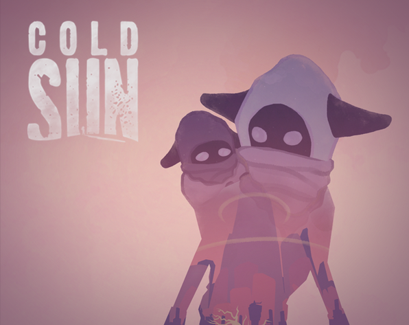
COLD SUN (2019)
Cold Sun is a third person stealth exploration game set in a post-apocalyptic world. Avoid scavengers and search for ressources across deserted landscapes as you and your young brother make your way to the last habitable oasis.
Inventory menu.
Enemy detection icons.
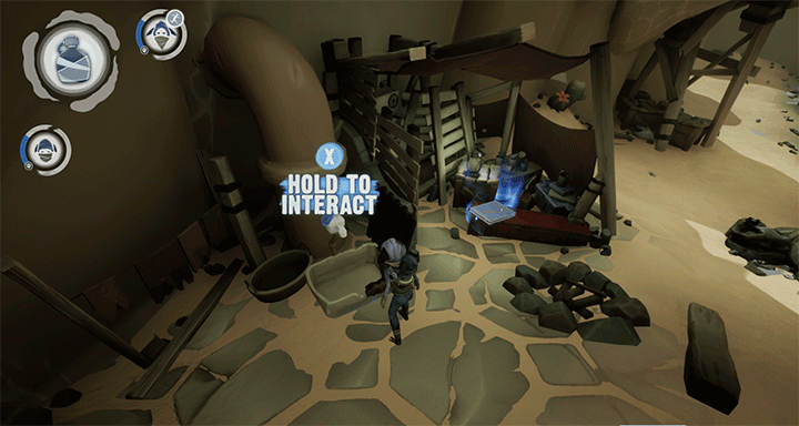
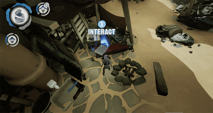
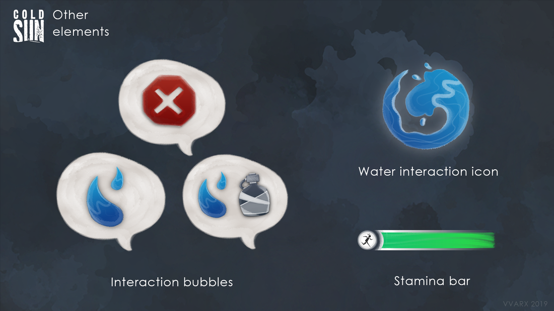
Water interaction icons.
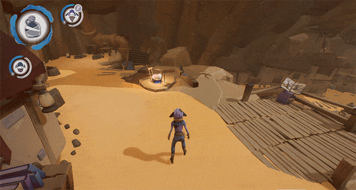
Bubble icons when interacting and HUD animations when distributing water.
|
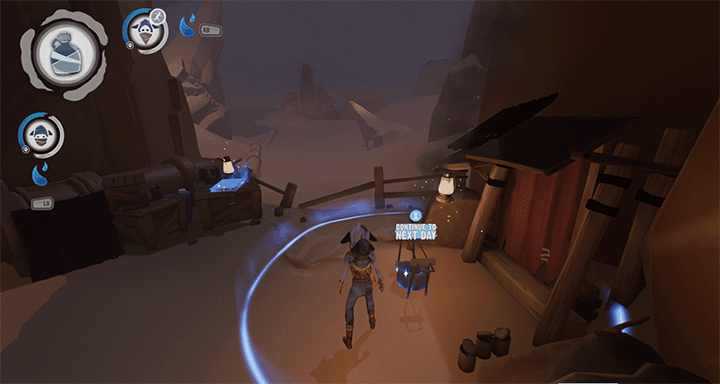
HUD animations when no water can be distributed.
|
|
LOGO AND IDENTITY
My pillars for this design were post-apocalyptic, solitude and voyage. I placed the silhouette of the main character at the center of logo and framed her within the negative space of the 'U', evoking both a sense of oppression from the towering letters as well as a feeling of isolation. The shadow and sand dune at the base of the image give a sense of dept, and the chosen font*, purposely erroded, calls back the desert environement of the game. * Dirty Headline - Font by S. John Ross Cumberland Games & Diversions www.cumberlandgames.com (Free for personal use) |
Cold Sun's final logo.
|
Concepts for the Cold Sun logo.
LOADING SCREEN
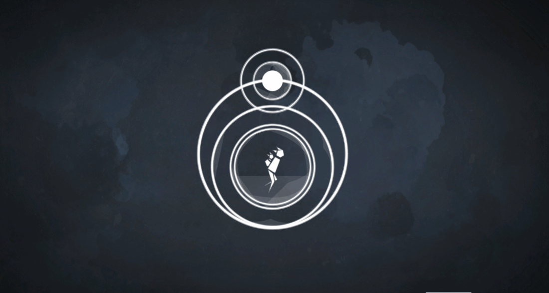
Cold Sun's loading screen.
Inspired by the game's logo, I then put together a loading screen.
Evoking once again the themes of voyage and the solitude, I animated a fragmented silhouette surrounded by the whirling sun and moon,
indicating the passage of time.
Evoking once again the themes of voyage and the solitude, I animated a fragmented silhouette surrounded by the whirling sun and moon,
indicating the passage of time.
HUD AND INVENTORY
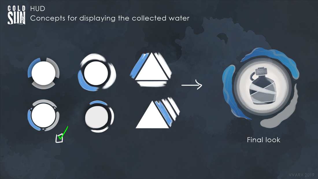
Concepts for the water collection HUD.
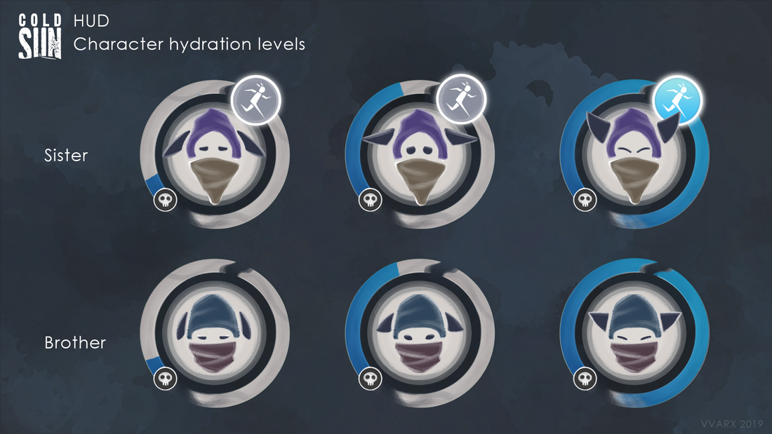
Character hydration levels.
HUD
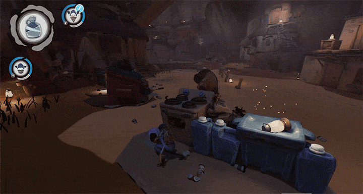
The HUD in our game was a key element, seeing as water was a necessary ressource not only for the main character, but also her younger brother. Throughout the game, the player can collect water from pipes and distribute the water at campsites.
If your player is hydrated enough, she gains the ability to sprint. This is illustrated with the ability icon that glows blue when the hydration level is reached.
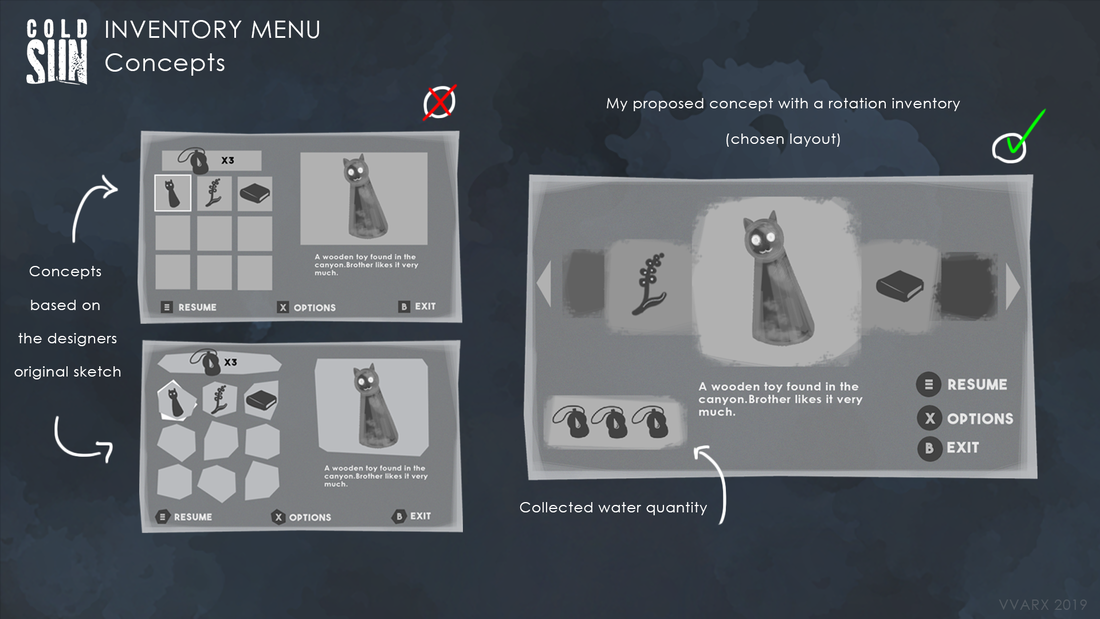
Inventory menu concepts.
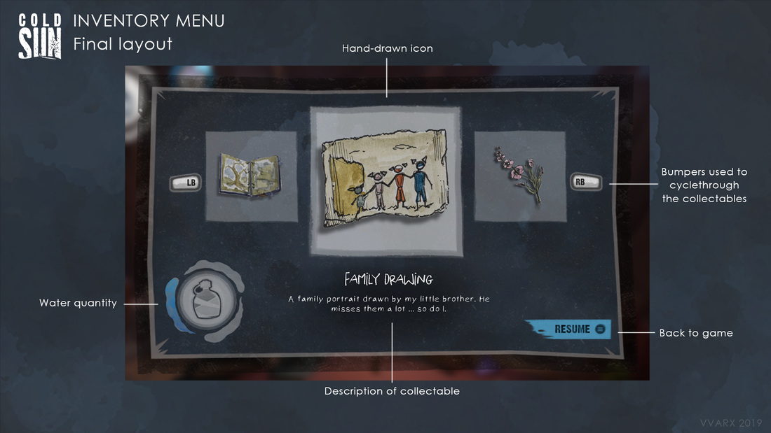
Final layout of the inventory menu.
|
INVENTORY
During the game, the player can collect objects and view them whithin an inventory menu. The designers had given me a sketch of what they wanted (a simple grid-style inventory system), but I decided that a menu that allowed the player to circle through their collected objects was much more visually interesting for the player. It allows a better view of the object and eliminates a lot of wasted space with a grid layout. I also asked one of our concept artists, Claire Duchaine, to illustrate the icons of the menu. These childlike illustrations, matching those seen in the game's introduction, fit the narrative, in which the sister character is documenting her voyage through an illustrated journal. I also created a custom font used for the description of the objects. |
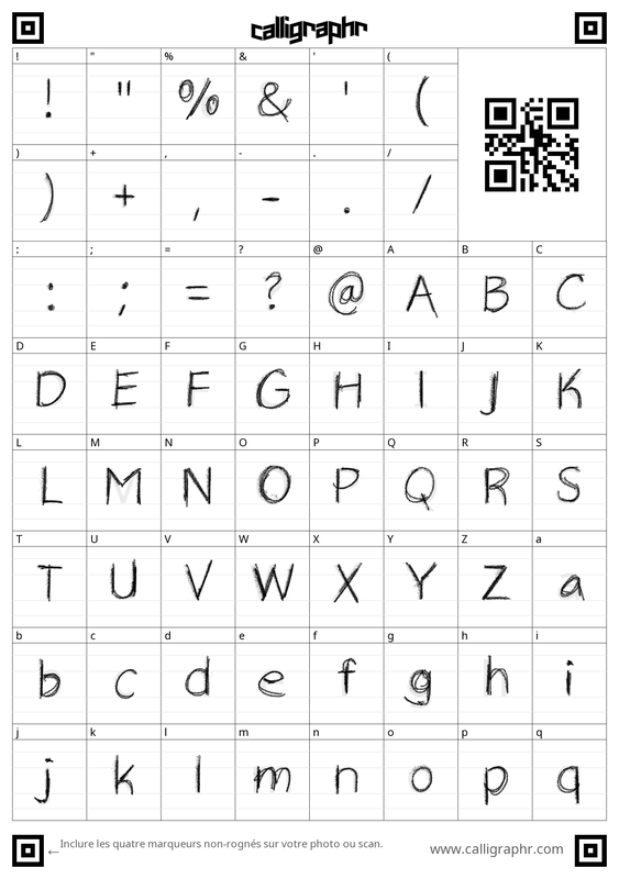
Custom font created for the inventory.
|
ALERT ICONS
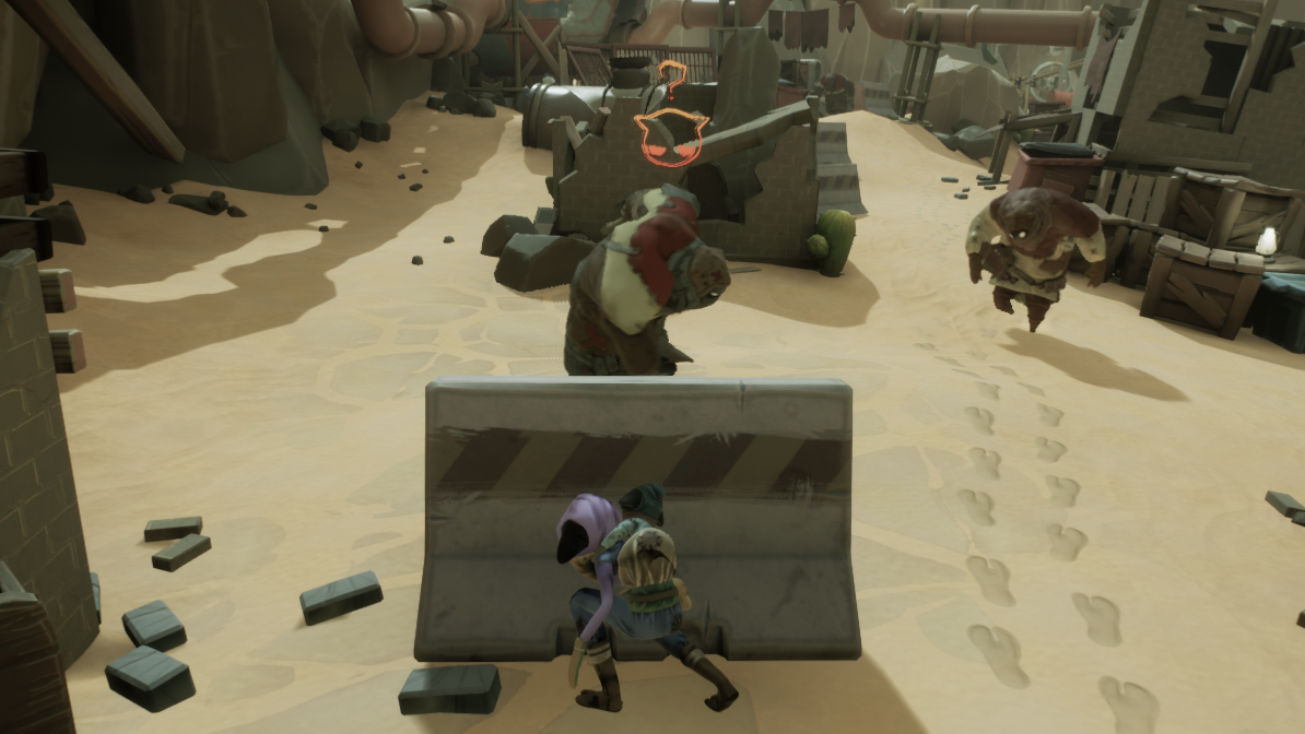
The duo hides from a patrolling ennemy.
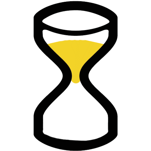
Hourglass (1st version of icon)
|
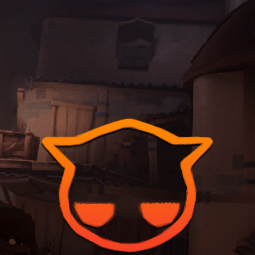
Detection gauge (final version of icon)
|
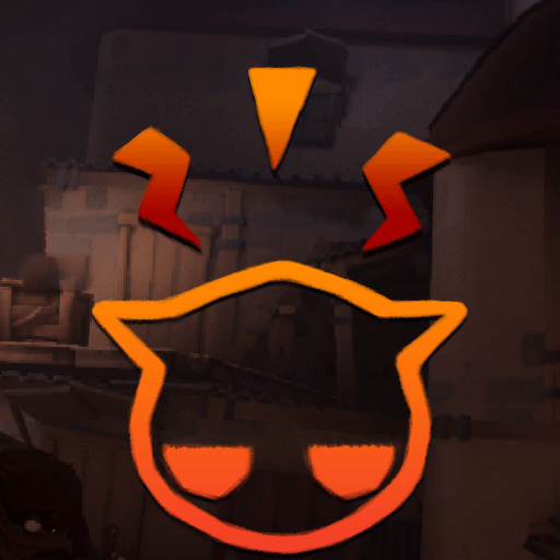
Chasing the player
|
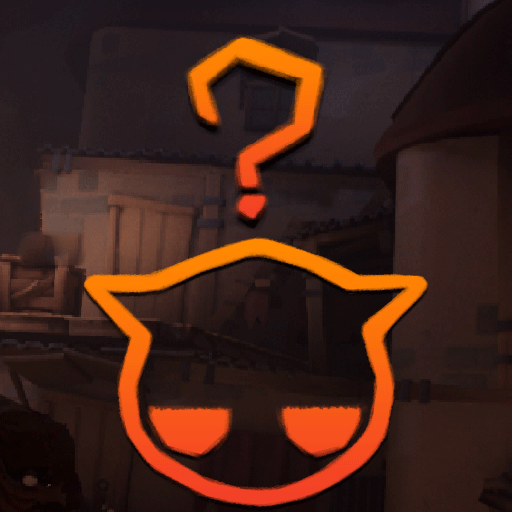
Searching for player
|
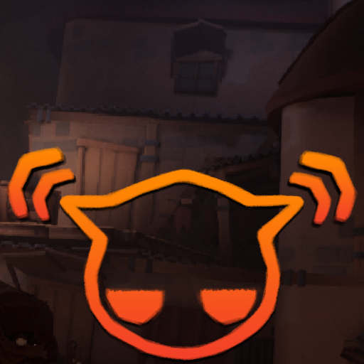
Hears the player
|
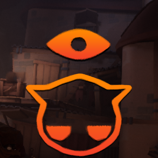
Sees the player
|
MARAUDEURS
The main ennemies in our game are the marauders, desert brutes ready to steal ressources from you at any moment. Since our game was stealth heavy, we needed clear icons to let the player know if and when they were detected.
I tested out an hourglass look for the first few playtests, but after feedback, quickly realized the shape wasn't clear enough for our players.
The final look of the icons was based on the marauders themselves, with the gauge filling up as the ennemies sense the player's presence. The eyes, that turn angry when you've been spotted, also lend a certain comedic tone better suited for the stylized look of our game. The designs allows the player to know much faster when they're in danger.
INTERACTIVE ICONS
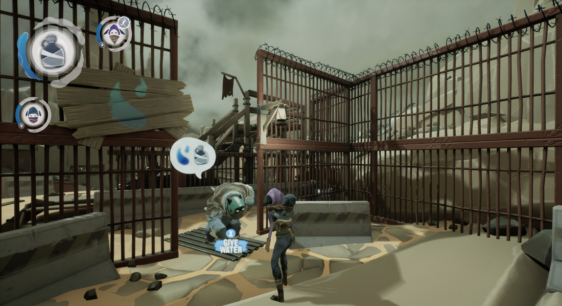
Bubbles are displayed when interacting with characters
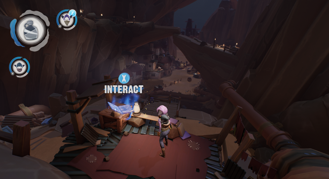
Interact icons appear above collectable objects.
INTERACTING WITH THE WORLD
In the first level of the game, the player is introduced to the main mecanics, including crouching, sprinting and interacting with objects.
With a brutalist font evoking the main title and a brighly coloured button that contrasted well with the environment, I created these icons to help show the player how to navigate the world.
Easy to understand bubbles are used when characters interact with one another, for example, when the player needs to bribe the guards.
|
Water icon spins when player collects water.
|
Stamina bar appears when player sprints.
|
INTERACTING WITH WATER
As in the HUD, I needed to make water and water collection one of the most visually prominent elements of the game.
When the player finds a faucet, they can interact with it to retrieve water, triggering a bright flashing water icon that spins until the player has collected one water ration (that is then displayed in their HUD).
Again, the electric blue used in this icon stands out againsts the sandy desert and the spining animation that mimics the turning of the faucet helps establish a link between the two actions.
The bright green stamina bar was also designed with maximum visibility in mind, making it easy to see when the player is near exhaustion.
OTHER ELEMENTS
|
|
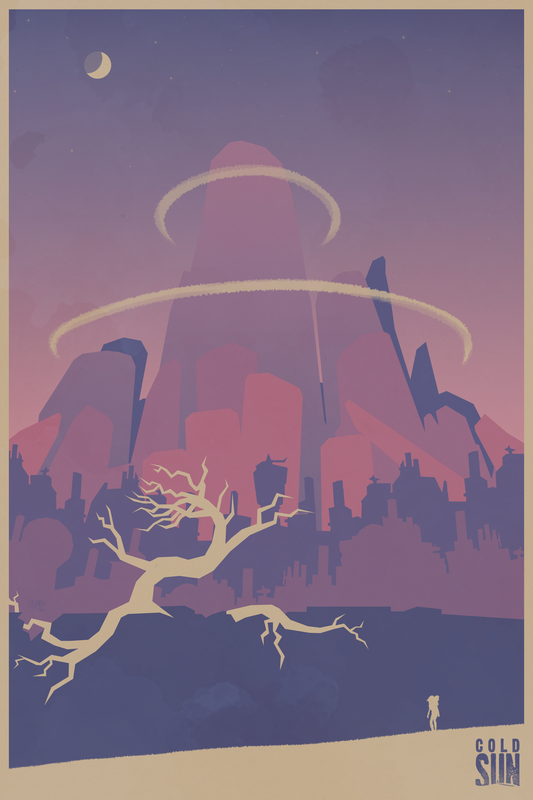
Other Cold Sun promotional illustrations I made (thumbnail for Gamejolt website and poster).
